About 10 years ago, while producing a major annual report, I became fixated on an idea. My client funded social science research, and needed to communicate some heady ideas – ideas about research and discovery – ideas concerning the value of uncovering answers, or even revealing the questions, that would help shape society’s future. My personal challenge – the thing I became fixated on – was how could a visual communication designer express and transfer the authentic concerns and goals of social science researchers, the critical element of my client’s message, within a visual design. Previous reports had attempted to convey the authenticity of their research goals through stock photographs with large superimposed type, making hyperbolical statements (sound familiar), resulting in toothless and superficial non-messages. Everything seemed fake – illegitimate. Without visually depicting their research, their concerns and outcomes in a authentic way, I felt they were, as David Ogilvy might have suggested, unadvertising their cause.
About the same time, I judged the Metropolitan Washington DC Art Directors Club show, where I met two American designers, John Sayles and Earl Gee. Earl had been approached by Catherine Fishel who was compiling the book, 401 Design Meditations. He suggested she give me a call, to see if my “meditations” were worth sharing. My fixations on the subject of genuineness and authenticity were inspiring my philosophical ruminations, and I shared a quote that has since been extensively shared over the Internet. I suppose that this statement unpacked my thoughts, and was for me, where it all began.
The quotation read:
Design should never say, “Look at me”. It should always say, “Look at this”.
We can illustrate the quote visually, as shown in figure 1. This illustration shows the three basic components of a visually communicated message. The cube (c) represents the idea or thing to be communicated (the raw message), the person (a) is the message receiver (the user), and between them is the message (b) that the communication designer creates to represent the original idea. We can call this the “mediated” message. The responsibility of the message designer is immediately clear. If the message is poorly designed the receiver will not reconstruct the idea properly. The message designer can’t show the receiver the original message, as the message receiver can’t usually sit down and interview the author, so the visual communication designer recreates the message and places it on a visual plane (or 3-dimensional space) for many receivers to see.
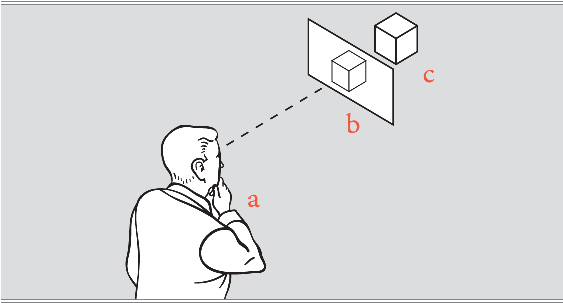
Figure 1
Considering my concerns of communicating genuineness and authenticity (my client’s – not mine), I was simply stating that the role of communication design, and basically of any design discipline, is to draw attention to the subject being communicated, and not to the superficial appearance of the design itself. For example: the handle of a carving knife should communicate with the palm of a human hand, and its appearance should convey how to grasp it. A communication design should convey an idea, and not information about its designer, or a style the designer likes.
Don Norman’s concept of “affordances” reflects this concept – that the relationship of the design to the user can form a utility that empowers that user. A visual communication design should “afford” the user the meaning of the author’s message. It should signify the author’s meaning efficiently. Generally, then, the role of the communication designer is to reconstruct a source message or idea in a way that can be transferred through visual means*, sent through various channels – through basic eyesight (a poster), the Internet (a website or phone), the page (a manual) etc. The goal of a visual communication designer is to do this well, and this means that communication designers are more concerned with the functional properties of their designs, than in specific concerns such as aesthetics, typography, style or fashion, unless these attributes serve to convey an idea or message better.
So that explains my quote of 10 years ago, and for me, where it all began. But that is not what this blog is about. It is all about what happened next. After 2005, I attempted to create an analytical system to describe fundamental communication design concepts – concepts that design students and designers could use to analyze design effectiveness. But I didn’t understand the process of design research, and how to incorporate theories from other disciplines that could potentially contribute to my work. This forced me back into the education system. As a full-time design professional, and part-time student, I completed a Masters degree in Design, where I studied information theory, communication, psychology and other disciplines influencing visual communication design.This blog will discuss some of the fundamental concepts and theories uncovered through my studies, and further the exploration and discussion of communication design theory. And don’t worry about it being too dry, because it won’t be. Plus, I promise to digress.
* Visual communication designers may offer their clients expertise in knowing what can be visually conveyed, and how best to do this, and thus may contribute to the shaping of the original idea as it becomes a mediated message.
Good to see this out in the world……looking forward to it all.
Doug
I am looking for like souls, or those who find this of interest. Thanks.
Super. The explanation was clear and succinct. Looking forward to future blogs.
Thanks Simone for the good words. I hope you enjoy the blog.
Great introduction to a fascinating sphere. I am especially intrigued with applying principles that work for physical product utility to the field of graphic design. Recognizing that the message is more important than the messenger seems to be a challenge for many in much the same manner as the worst movie soundtracks tend to be the ones we notice. I am very glad Debra provided this link and will look forward to learning more
Thanks. I am new to blogging, but not to design research. I want to stress that the “form” component of product utility is part of what I will discuss, and I don’t mean to dismiss the importance of form – I mean for form to be form that works. I will also get somewhat into the concept of “affordances” as they relate to visual communication design. Not exactly sure when, but this may also relate to product utility values. I may also discuss the product utility value of “time” which could be related to visual communication design issues to a certain degree.
Thanks for the comment.
Congratulations on the launch of your new blog:) Looking forward to reading about “how you got here”. Interested to know exactly went in to coming up with a metric to determine the effectiveness of fundamental communication design concepts
Thanks for the support. A far as the metrics, there are many, and the process of coming up with them was more like archeology than invention. I will be presenting some of them at the Design Research Society conference in Umea, Sweden, next week.
This is awesome!!! Looking forward to reading more!
Thanks for the inspiration. This will be a weekly blog so stay tuned.
Welcome to the blogosphere David! I found you through Debra’s blog. This is a subject I’m interested in, as I write a blog post every week, and struggle with how to create a visual image to go along with it. I’m an interior designer, and have huge admiration for all types of design, now including comm design. It’s nice to meet you.
Meredith. Thanks. Since you are a designer you may find my posts parallel some of your issues with design, and may help with your visuals. I think the hardest part is being frank with yourself about what you mean to say, and not using wallpaper images to say it. Authentic images stand out and ooze meaning in these days of stock photography.