When I began designing, my colleagues and I thought the purpose of graphic design was to make things look intriguing. Working with typographic and graphic elements, we created interesting compositions with aesthetic integrity. We wanted our clients and bosses to be happy, but we felt the design was our design, and our ultimate goal was to produce a design worthy of winning one of many coveted design awards.
And this was inspired by the way design awards were judged by much of the design establishment. In order to judge winning designs in design shows, judges cantered past hundreds (to thousands) of entries of similar designs to see which ones literally leapt of the table. Designs were judged on their aesthetic appearance, and reprinted in design award annuals in postage stamp sizes with little or no attempt to understand or convey what the designs actually meant.
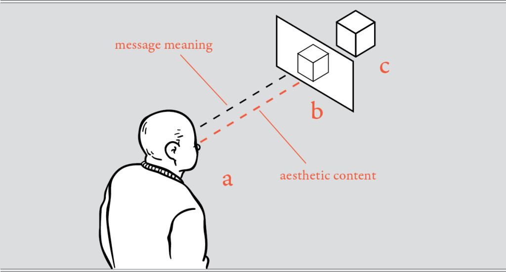
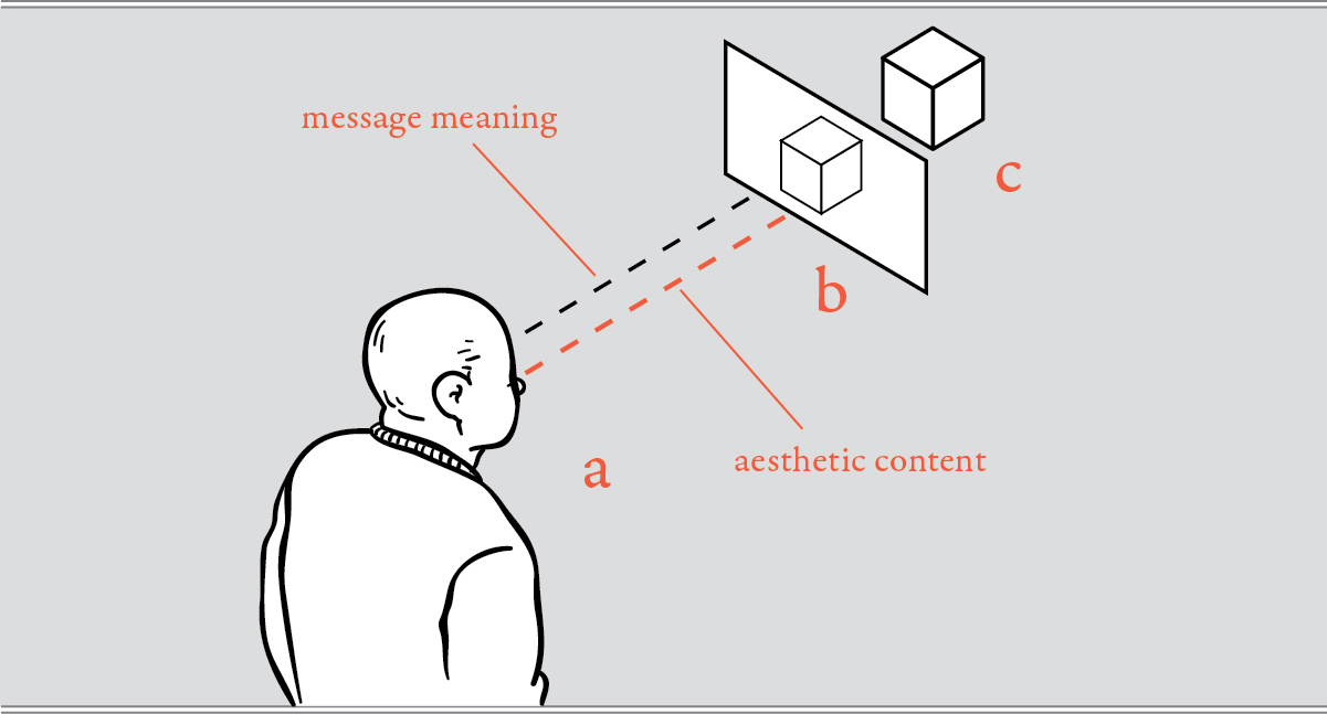
Figure 1
When a design is judged aesthetically, the judge (a) looks at the design (b) without the means to understand the client’s intended message (c), separating the design’s content from its aesthetic.
It would be impossible to judge communication effectiveness in this manner, as a judge would have to read, look, see and understand each entry. They would have to behave as if they were receiving a complete message – more than just the aesthetic content. Judging communication design competitions could take months.
And this is the major problem with the way we have judged visual design – that we unwittingly separated the aesthetic component of a message from the main content of that message, then judge the aesthetic component, and claim to have judged the design’s quality. The result of this is that award winning design – design that students and young designers search out – is not necessarily effective or good design. And this inspires the following inquiry.
• What is the purpose of graphic design?
• Is design mostly aesthetic effect?
• Can one design communicate better than another design?
• Does good quality design actually create visual meaning?
GRAPHIC DESIGN VS. COMMUNICATION DESIGN
Is graphic design an aesthetic process, with aesthetic goals? This question has led many designers to question the purpose of what they do. In recent years, this inspired Icograda, “the International Council of Graphic Design Associations” to redefine themselves as “the world body for professional communication design”[1].
Icograda goes on to define communication design:
Communication design is an intellectual, technical and creative activity concerned not simply with the production of images but with the analysis, organization and methods of presentation of visual solutions to communication problems[2].
Icograda obviously believes the purpose of graphic design is to solve communication problems. This is one of the traits of design that separates it from visual art, and this also means its primary goal is not aesthetic, but functional. And their definition would suggest that the “analysis and methods of presentation of visual solutions to communication problems” could be achieved to lower or higher degrees of quality.
DOES GOOD DESIGN CREATE VISUAL MEANING?
To Wilbur Schramm, the communications problem, in regards to meaning, stems from more than just language differences. It is based on a broader concept he calls the “field of experience” [3]. Schramm’s field of experience includes language, but also other information, ideas, images and events accumulated through the life experiences of each sender and receiver of a message. A person’s field of experience becomes their mental “legend”; their personal sign-system that they use to comprehend what they experience – and to process the designs they confront.
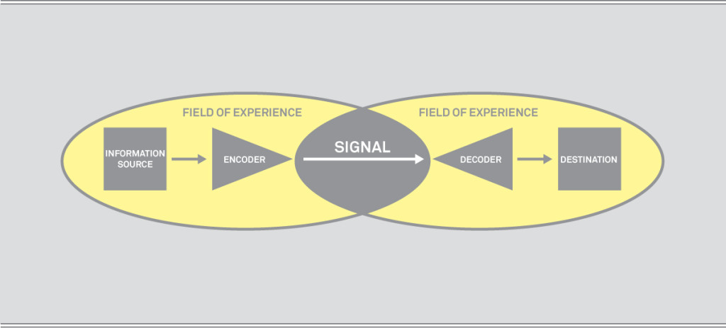
Figure 2
Schramm’s field of experience diagram (Schramm, 1954, p. 6).
Figure 2 shows that the sender and receiver’s signal (message) only has meaning where the fields of experience overlap. Every non-common part of their field of experience (highlighted in yellow) is not communicable between them. “This is the difficulty we face when a non-science-trained person tries to read Einstein, or when we try to communicate with another culture much different from ours”[4].
According to Edward Tufte, we should use words, numbers and illustrations together, in order to communicate complex ideas clearly[5]. This approach to meaning creation – the use of different “modes” of communication – is termed multimodality. The benefits of using different communication modes simultaneously is supported by cognitive science research, and described by dual coding theory (see theory post 3). Dual-coding theory says our brains are theorized to process visual events and objects through a visual processing stream, and words and numbers and text simultaneously through a language processing stream[6]. So images can be processed in the brain, while language is simultaneously processed, interacting and supporting visual experiences (and vice-versa). This increases the meaning of what we see.
To finally answer the last of the four questions stated above, good design can increase visual meaning. It does this by choreographing the interaction of visual elements, communicated simultaneously through different modes, which, if properly combined, are processed in our minds elevating the meaning of the messages we receive. A graphic designer – or as Icograda would say – a communication designer, creates higher quality design by producing a higher quality multimodal visual representation (using text, numbers and images), aimed more accurately at the message receiver’s field of experience – thus communicating at the highest quality. Doing this well is the communication designer’s ultimate reward.
[1] [2] Icograda website (2014). About. Icograda. Leading Creatively. Retrieved from http://www.icograda.org/about/about.htm
[3] [4] Schramm, W. (1954). How communication works. In W. Schramm (Ed.), The process and effects of mass communication, Urbana, IL: University of Illinois Press.
[5] Tufte, E.R. (2001) The Visual Display of Quantitative Information, 2nd Ed., Cheshire, CT: Graphics Press.
[6] Paivio, A. (1986). Mental representations: A dual coding approach. New York, NY: Oxford University Press.

Share this
Posted in theory. Leave a comment.