Ask yourself, how would you understand the concept of dark without light, up without down, or good without bad? Could you?
Ferdinand de Saussure is one of the early developers of the discipline we call semiotics – the study of how our minds establish meaning. Halfway through Saussure’s seminal book Course in General Linguistics, he abruptly states, “everything that has been said up to this point boils down to this: in language there are only differences” [1]. What he really means, is that thinking creates meaning through the differences between the conceptual elements (signs) that make up our thoughts (like good and bad, dark and light).
In the 1990s, Jean-Marie Floch brought semiotics into the world of marketing. Floch described the nature of Saussure’s “differences” stating that the value of semiotics “is to demonstrate that there are different and complementary things, or rather positions, as well as others that are different but contradictory [2]. Floch went on to explain that what semiotics could do, was to illuminate not just the differences that make ideas work, but to define the more subtle relationships between these ideas [3]. This is important to designers, as they seek to establish precise visual meanings.
To Floch, semiotics was an approach to understanding the real world. Semiotics – born through the study of linguistics, yet also tied to psychology – has a much wider application in interpreting and creating meaning. Not just about the meaning of language or text, semiotics may be used to understand the behaviour of people in certain situations, or the meaning of a film, or the image of a corporate brand [4].
Floch also became expert in the use of conceptual tools used to define the meaning of things – one of which was the semiotic square. Developed by Algirdas Greimas, and discussed at length in his book On Meaning, we can think of the semiotic square as a device which enables a person to create and encapsulate a discussion about how the meaning of a given topic or situation is created, and ultimately to understand what its meaning is [5].
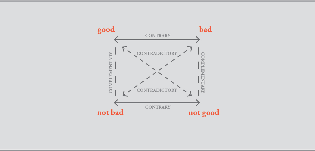
So let’s return to the beginning – to the discussion of differences. If we want to understand if a situation is “good”, we must also consider that it may be “bad”. This kind of relation is known as a semiotic axis and specifically, this axis expresses a contrary relationship. As shown in figure 1, Greimas places this type of relationship along the top horizontal axis of the square [6].
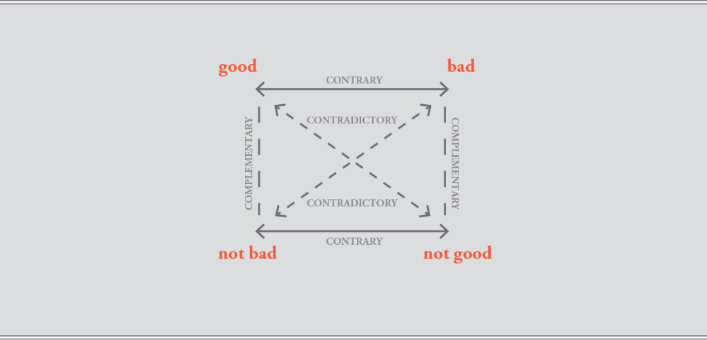
Figure 1. The semiotic square (Adapted from Floch, 2001, p. 22).
But meaning is not that simple. Something may be good or bad, but a situation may also be “not bad” instead of “bad”. Likewise a situation may be “not good” as opposed to “good”. These are relationships of contradiction and Greimas depicts this type of relationship along the diagonal axis of the square. Due to Greimas’ locations of the contrary and contradictory relationships, a third relationship emerges between the vertically opposed pairs in the square (such as a situation that is somewhere between “not bad”, and “good”). This is a complementary relationship [7].
Although this seems a bit complicated – it really isn’t. Greimas’ semiotic square simply shows us that there are several kinds of differences, and since ideas are defined through differences, we must consider contrary, contradictory and complementary differences when understanding the nature of an idea.
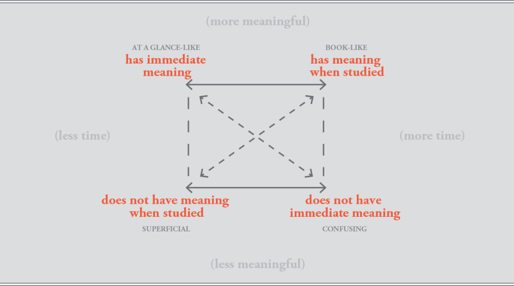
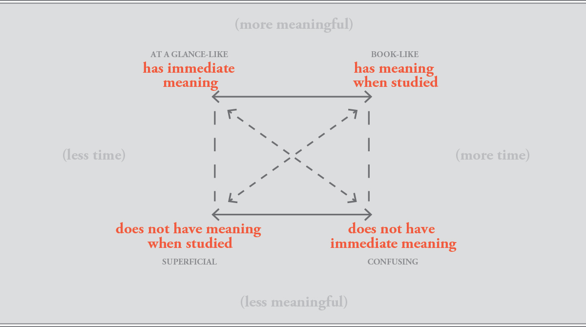
Figure 2. At a glance presentation analysis
(adapted from Craib, Imbesi, 2013, p. 6).
Here is a real-world example. The semiotic square shown above was developed to explore the effectiveness of corporate at a glance presentations. These presentations are often developed for annual reports or as stand alone presentations, where a quick understanding of a corporation’s structure or activities is required to understand the essence of the organization. An at a glance presentation must offer a high amount of meaningful content, but deliver its information quickly. In this way, it is a perfect design test subject, as it is, in a design sense, a visual environment under stress. The semiotic square, shown above, becomes an analytical tool we can use to understand, and rate the effectiveness of corporate at a glance presentations [8]. What we want to find, with this particular semiotic square, are at a glance presentations that tend toward the upper left area of the semiotic square. Various aspects of their designs may prove to be confusing, or they may be light on real content, proving to be superficial, or even full of content making them difficult to visually scan. Presentations that tend to the upper left, should be better at communicating quickly, and have more meaningful content.
The semiotic square can help us to break the code of what is meaningful, what is not, and how a visual design performs.
[1] Saussure, F. d. (1966). Course in general linguistics. (W. Baskin, Trans.). New York, NY: McGaw-Hill. (Original work published 1916).
[2] [3] [4] Floch, J-M. (2001). Semiotics, marketing and communication (R. O. Bodkin, Trans.).London: Palgrave Macmillan.
[5] [6] [7] Greimas, J., G. (1987). On meaning: Selected writings in semiotic theory.(W. J. Berg, trans.) Redlands, CA: Esri Press. (Original work published 1967).
[8] Craib, D., Imbesi, L. (2013). Enhancing visual meaning: Measuring visual communication design effectiveness. Paper presented at Design Research Society (DRS) 2014, Umea, Sweden.

Share this
Posted in theory. Leave a comment.